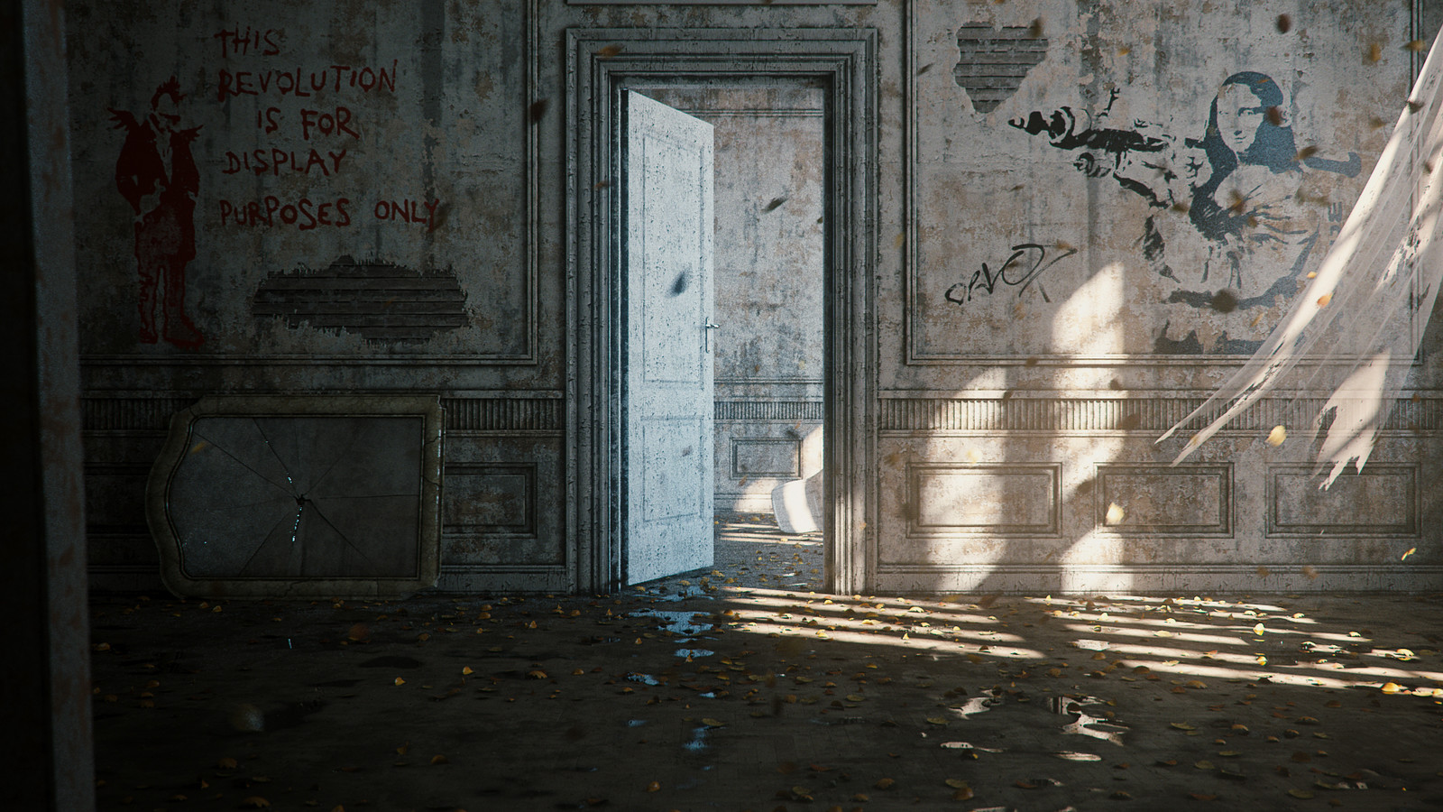
Interior A - Degraded
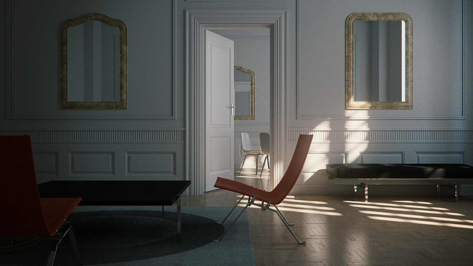
A lighting and shading exercise I did in class for my students.
The idea is to grab a simple interior scene light and shade it first in a clean version and then in a degraded version.
I used the geometry of an old Evermotion scene.


